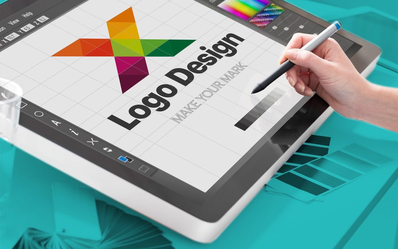
Creating a logo can be quite a complicated task since it requires being very clear about the brand concept that we want to convey in order to capture it in a single image. Once that work is done, we must materialize it in the form of a logo.
Table of Contents
What is a corporate image?
The first step in launching a brand is to create its corporate image. It is essential to design a logo that perfectly conveys the values with which we want our brand to be associated. It may seem like a simple task, but it is not. It requires dedicating enough time to be able to establish an effective and coherent image.
The corporate image of a brand is its cover letter, and it is the first impression that a client or user will have of a company or brand. That is why it is very important that this image is as close to what we want to convey.
In which sector is my brand framed?
Having a presence in the marketing sector is not the same as having a presence in the beauty sector, for example. Each one has its peculiarities, and therefore we will have to adapt this image to what the user expects of us.
Who is my ideal client?
It is another of the great questions that we must ask ourselves. Sex, age, interests, status. Our logo or brand image must be fully consistent with our target audience, and it must inspire confidence and seriousness. An uncared-for logo will give a feeling of neglect and lack of professionalism. Although it is not everything, a good image can open many doors for us.
Once we have answered these questions, we can start designing the logo in broad strokes:
Fundamental bases to create a perfect logo
Simplicity:
It is proven that simple logos are better remembered and are highly recognizable. For this, we recommend:
- Do not use too many colors, and it is best not to use more than two or three
- Use simple fonts which are very readable
- Better if the image is flat, avoid gradients, 3D, and shadows
Timelessness:
Normally, over the years, brands adapt their logos so that they do not become too outdated, but we must try to keep these changes to a minimum so as not to modify too much the brand image already created in the retina of our clients.
Follow the latest trends in design:
Like fashion, the design also has its trends. Try to adapt the color palettes and fonts to make them look current, but try to avoid something too flashy since it will surely go out of style soon. We must look for a “closet bottom,” something current but timeless.
Be original:
Before creating a logo, we must be sure that there is nothing like it, especially in our sector. Sometimes we think that we have had a great idea and we haven’t even copied it, but as they say, gunpowder has already been invented, so we will have to make sure that our idea hasn’t really occurred to anyone else.
Versatility:
We must think that the logo will be used in different formats and supports. For this reason, it is essential to be able to play with it so that it fits well with all the colors and can be adapted to paper format, web format, etc.
Brainstorming:
It is best to carry out this brainstorming among several people, and several minds always think more than one. But first of all, I recommend that you do a visualization exercise, look in design books, on Pinterest, or in any source or medium that you think might inspire you. Write down on a piece of paper all the ideas and answers to the questions about your company that we have previously raised in this post. Select the best ideas and check their originality.
Think about the most suitable color or colors to Design your logo
Color psychology studies the effect that colors have on the perception of behavior. For this reason, it is important to know the meaning of the different tones and the relationship they have with the professional sectors. For example, the red color symbolizes passion, action, danger, etc. If our company is framed in the health sector, this color would not be appropriate since it would shock us a lot visually. We must select a suitable color palette, about two or three colors that combine with each other. Once you establish your corporate color or colors, you must use them on your website and corporate stationery.
Select one or two fonts
Nowadays, the combination of two fonts to create a logo is quite fashionable. I recommend that you use a simpler stick or sans serif as a base and another a little more elaborate. If you go for this option, you probably won’t need much more to design your logo. Play with the position and size of both types to create a spectacular design.
Look for a representative icon
If, on the contrary, to create your logo, you prefer to use a drawing or icon that accompanies the name of your brand, you can opt for a vectorized element. This image must be fully consistent with the rest of the elements, such as color and typography.
Check that your idea makes sense and is well understood
When we work on an idea or concept for a long time, sometimes we lose our bearings, and we are no longer objective. In this case, it is best to ask someone who is not related to the project for their opinion. In this way, we can make sure that our idea is clear and understood.

